During a project downtime in 2003, I took an initiative to redesign our Federal Reserve Bank of Chicago seal. The original seal looked quite outdated and did not represent a grandeur quality of century old, yet important institution; At least that was the impression I had of it.
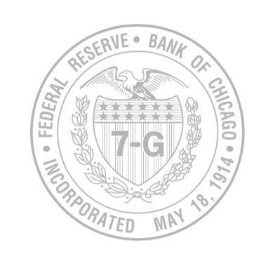
The old Seal
If I remember correctly, it took months just to come up with decent stylized Eagle redesigns. There were several concepts that were appealing to me. I combined them with a star-and-stripe crest and the branches – but none of them were quite there yet.
One day, I was standing on the side of the Continental (now Wintrust) building across from the Chicago Fed. I stood and looked straight up. Right above, in the middle of our building’s pediment, there was this bas-relief of an eagle with 7G on it’s crest, which represented the 7th District of Chicago. It was a part of the architectural elements of the building when it was built in 1922. I quickly rushed back to the drawing board.
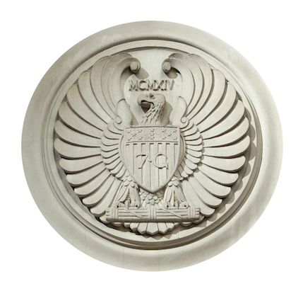
Bas-relief on the building pediment
The finished Seal redesign gradually rolled out. It was first used as a design element on the cover of the Chicago Fed’s 2005 Annual Report. Later it appeared in a more official manner when it was used as the screensaver on our bank-wide phones. The seal’s usage continues to grow, as it progressively appears on various items and applications.
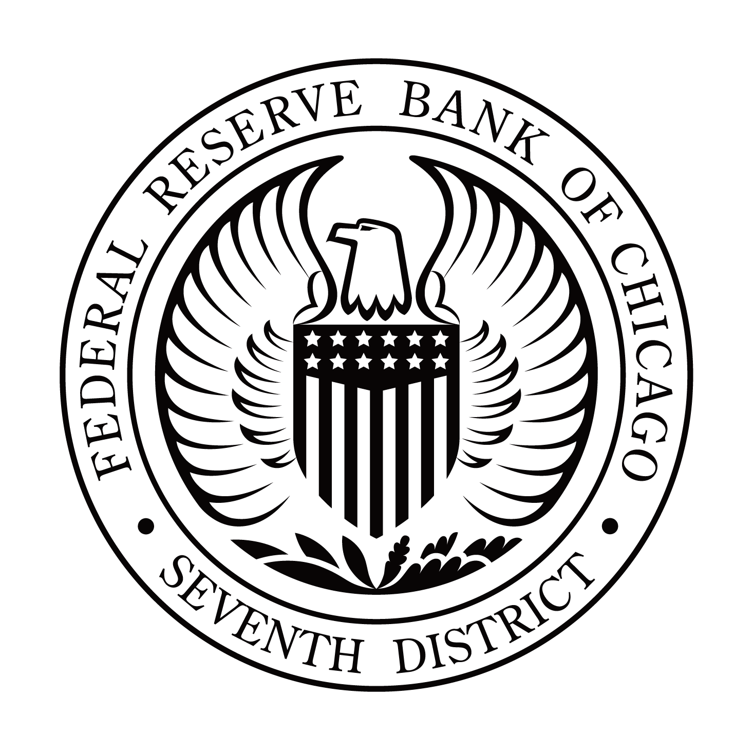
The New Design
The Design Process
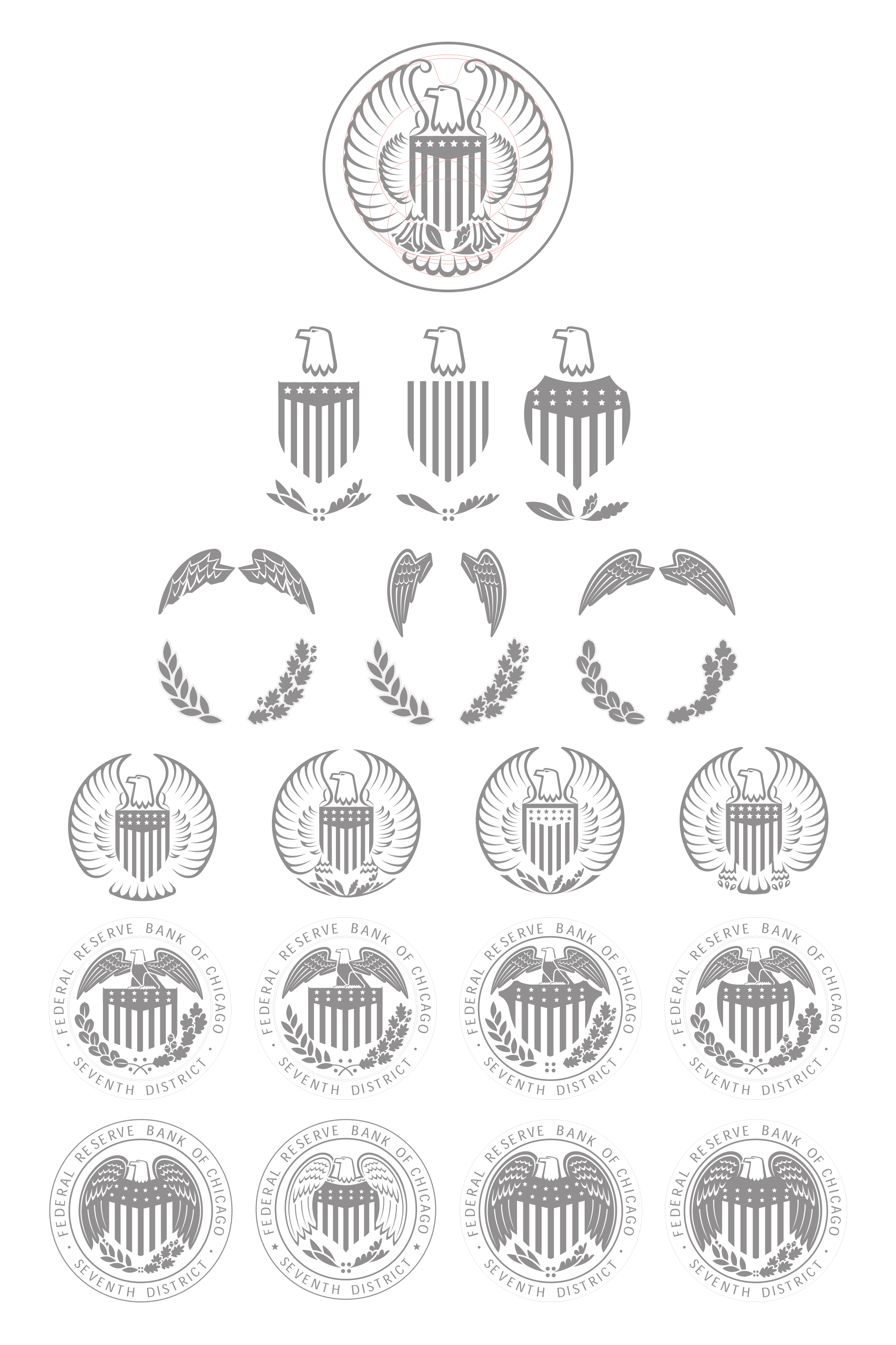
This is part of the process
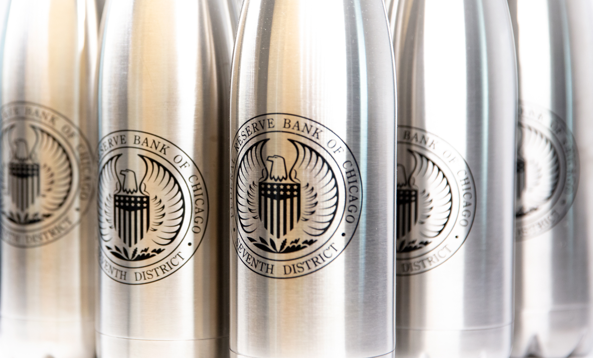
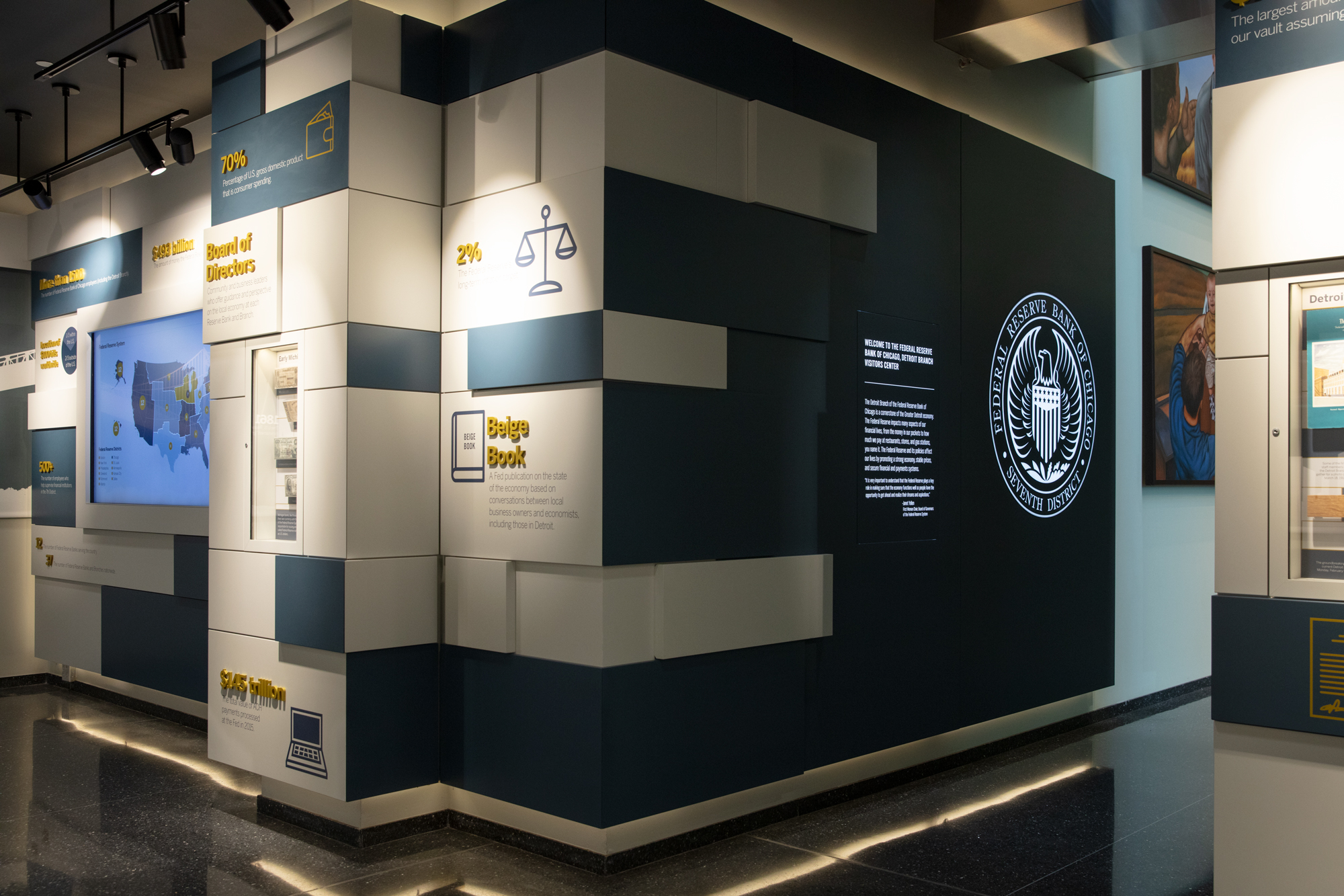
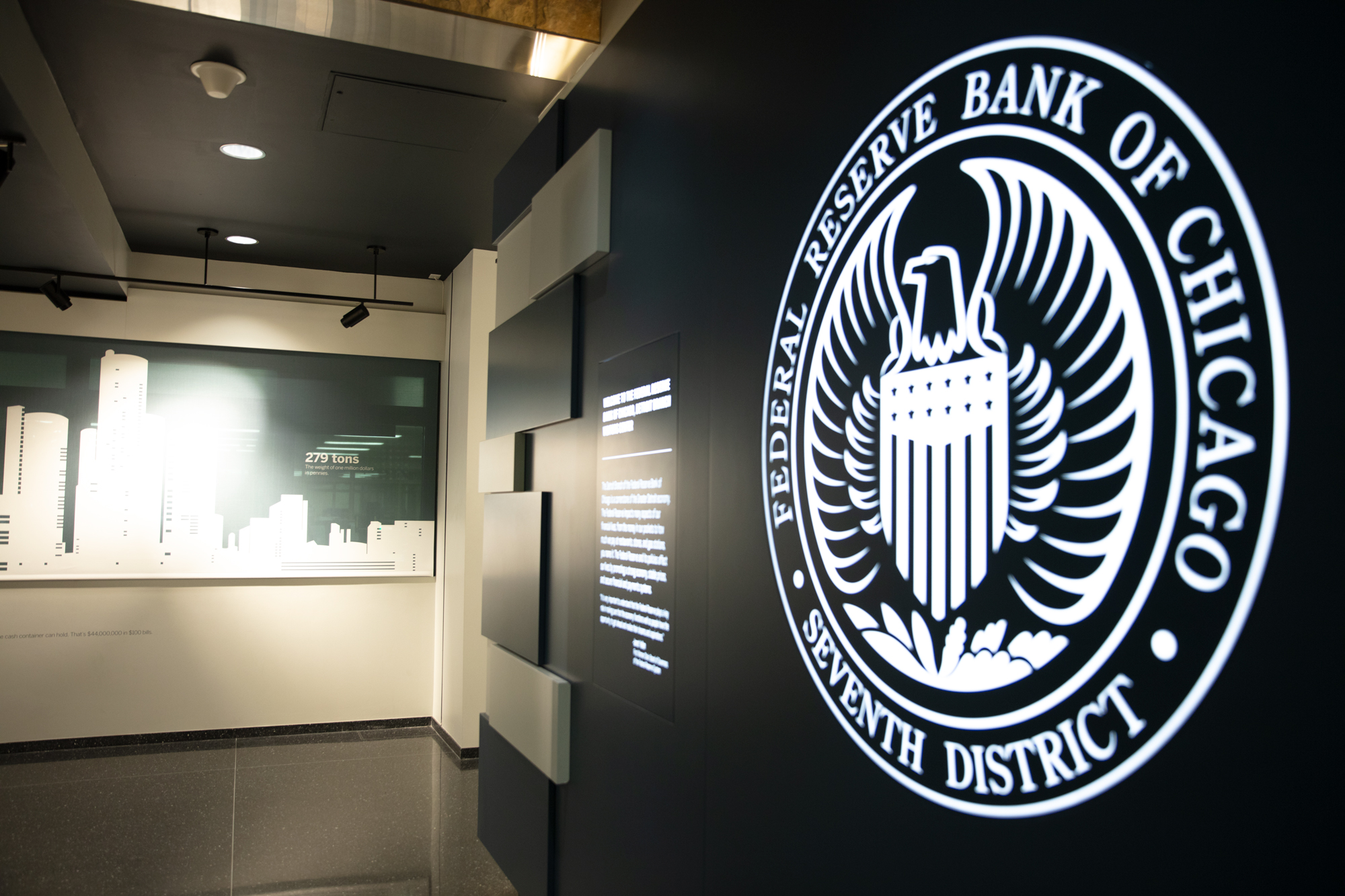
Applications
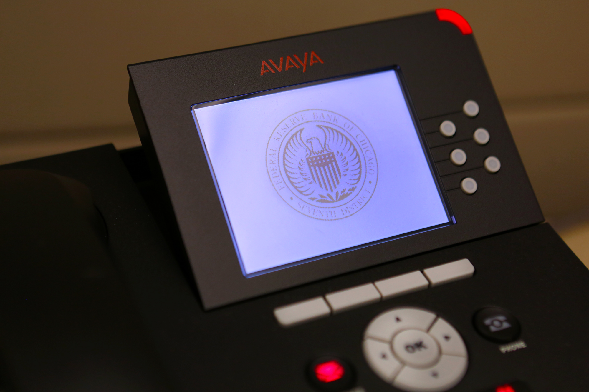
Seal image as phone’s screensaver
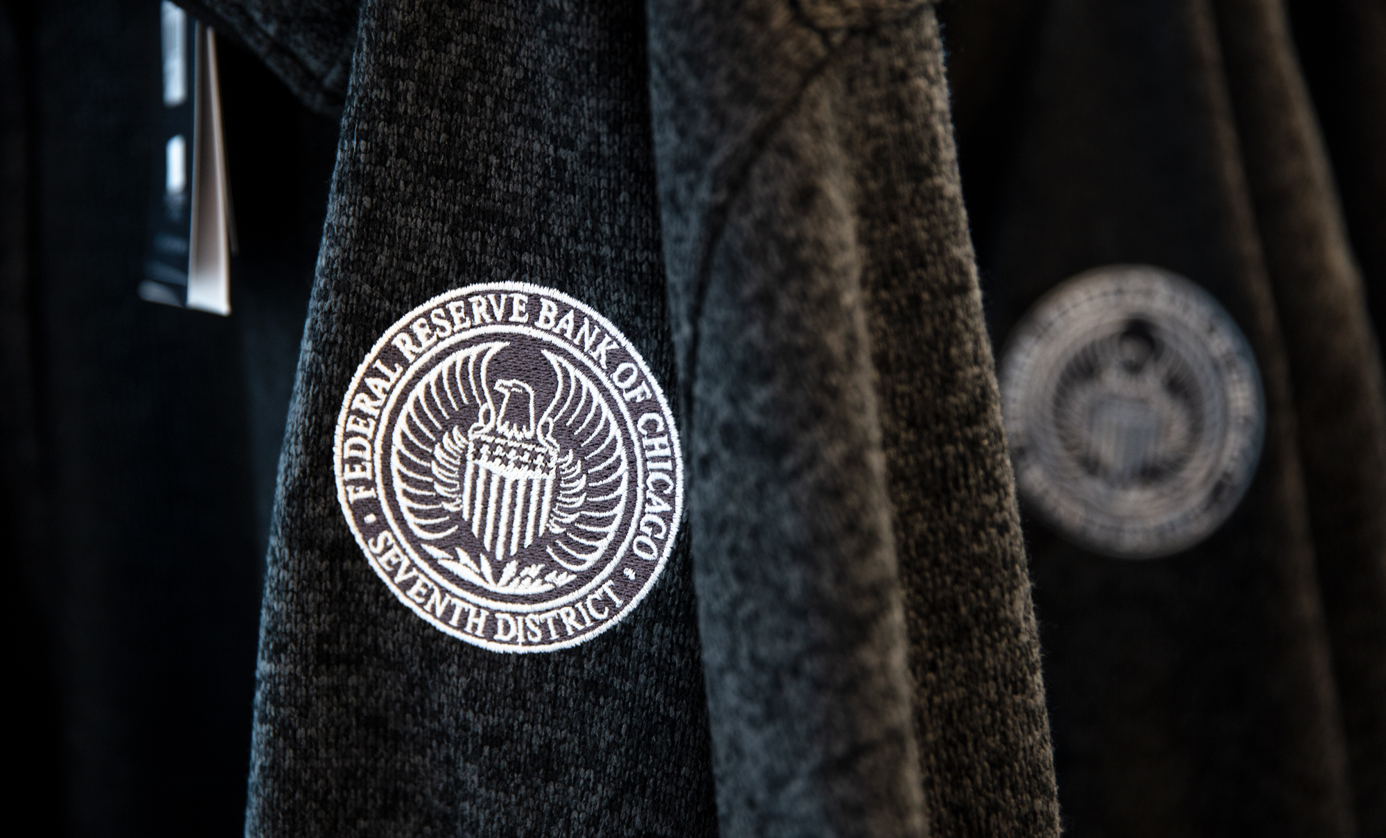
On merchandise
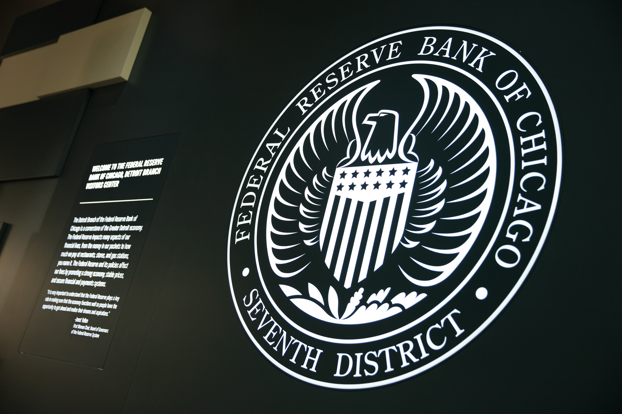
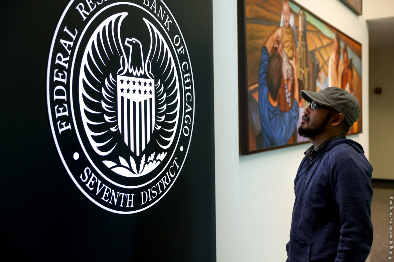
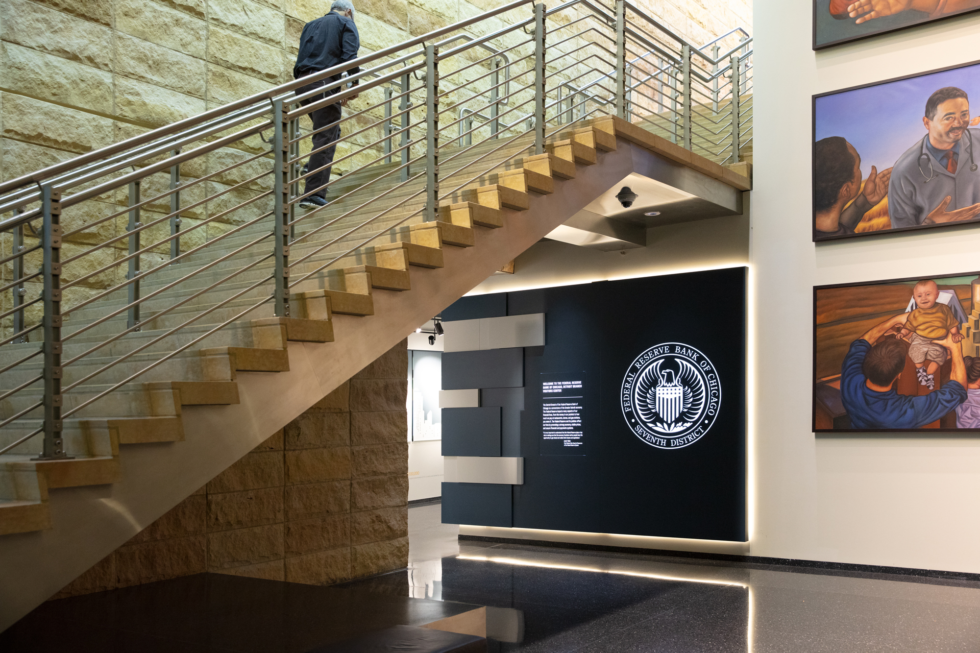
On the Detroit Branch Visitors Center’s exhibit wall
👍👍👍
Thank you!
Nice, love the thought and detail process on how you come out with the idea. Years ago, I also did some logo for a well known hospital. It so old, I forgot to keep it in file. But, they still use it till the day.
Thank You, Ly! : ). Good to know your design is still being used by the hospital! That’s amazing!
Awesome logo design, Ping! It has dignity, bold and crisp imagery. I wonder, in the application on wall somehow it look like 3D form, or just optical illusion?
Thank You, mba! 🙂 It’s an optical illusion — it’s the light glow makes it look like a 3D. It’s just a plain and flat logo with a back light.